
Is your website operating in a world where users are largely desktop based, or mobile advocates? The reality is that your answer to this question may contribute to your business’ success more than you’d think. The truth is, you have a much higher chance of obtaining a potential customer who is using a mobile device. As such, the days where you can pretend that the benefits of a mobile friendly site aren’t critical.
Mobile First Websites and Why You Need One
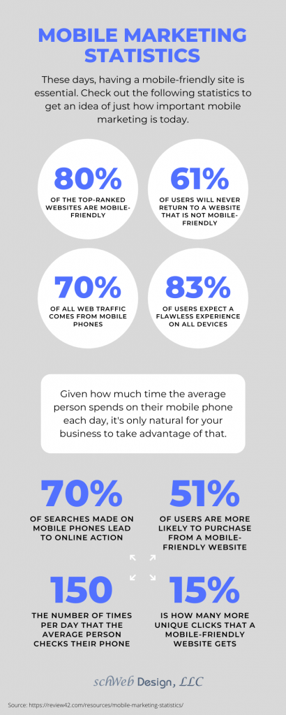
Mobile For Your Business: Show That You Keep Up With the Times
Consider this: according to Statistica, 94 percent of small businesses reported having a mobile-friendly website. Are you a member of the 6 percent who hasn’t taken the plunge? The good news is that it can be done, once you have decided to dedicate the time, money and right individuals to tackle the job. The importance of not only managing a website, but one that is consistent with the qualities desired by your target market, can not be overstated.
Another item you should consider once you correct the lack of a mobile first design is how long the website takes to load fully. Google has reported that over half of all mobile websites can expect to be abandoned if the site takes more than three seconds to load.
And let’s get serious: there’s search engine benefits to be had, here. There’s a reason Google has been consistently rewarding those businesses which embrace easy-to-find navigation bars, short forms and fast load times. Users flock to them! Google has shifted primarily into providing the best user experience they can by showing user-centric sites in results. Don’t remain in the back of the line when it comes to Google indexing.
In general, you can expect websites that have been constructed with a “mobile user first” philosophy to include the following characteristics:
- Differentiates between mobile responsive and mobile first (the former merely “converts” a rough version of your site into one that can load onto mobile devices, versus being designed with the mobile user in the forefront)
- Typified by a “to the point” message, coupled with a clear visual or media component
- Appreciates the “need for speed”: compresses images and keeps CSS clean
- Knows that just because someone is visiting your website, doesn’t mean they don’t want to know where you’re located IRL (ie include a physical address, phone number and email address)
Unlike what you might have heard, designing a mobile first (as opposed to a mobile responsive) website is necessary for business precisely because it increases your ability to do business. Stop losing potential customers to slow loading times, hard to click options, or difficult site navigation.
Unsure of How to Optimize Your Website for Mobile Indexing? Connect With the Experts at Schweb Design
We understand that not everyone has time to optimize their website for the Google mobile first recommendations discussed above. If you find yourself and your business falling into this category, or merely feeling overwhelmed, we can help. Why not get in touch with our experts, and discuss the ways that we can help to bring your website and offerings into the current (mobile optimized) times.